3 Important steps for Responsive Design
by muthu[ Edit ] 2013-10-14 12:08:49
3 Important steps for Responsive Design
Step 1
<meta name="viewport" content="width=device-width, initial-scale=1.0">
Step 2
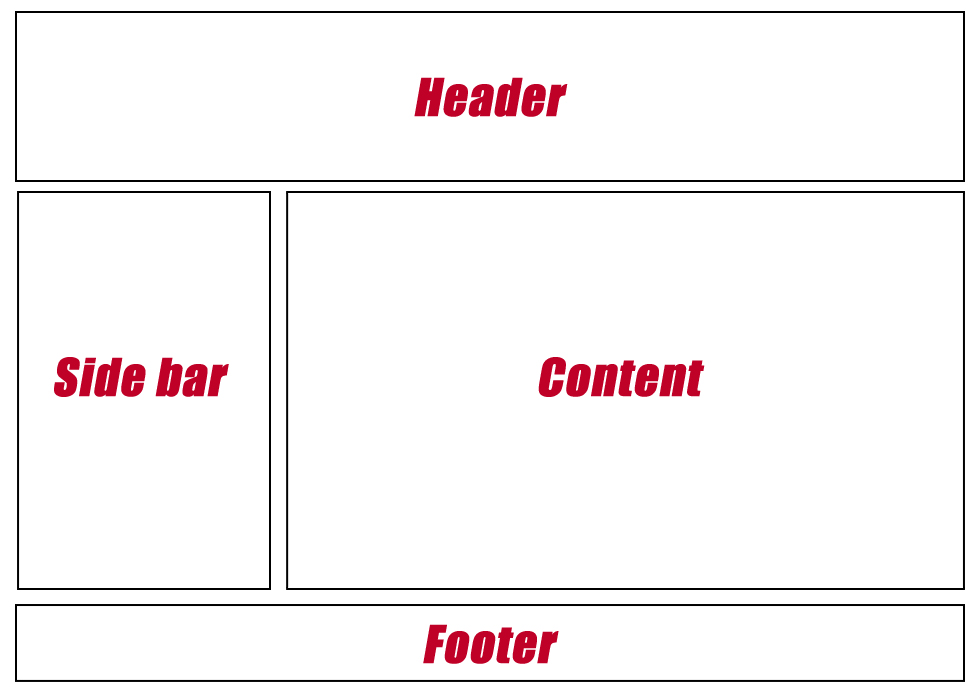
Normal Website design

Step 3
Media Queries
The Media Queries in CSS3 take this idea and extend it. Rather than looking for a type of device they look at the capability of the device, and you can use them to check for all kinds of things.
/* For (980px or Less*/
@media screen and (max-width:980px)
{
#wrapper { width:94%; }
#content { width:65%; }
#left_side { width:30%; }
}
/* For (700px or Less*/
@media screen and (max-width:980px)
{
#content { width:auto; float:none; }
#left_side { width:auto; float:none; }
}
/* For (480px or Less*/
@media screen and (max-width:980px)
{
#header { height:auto; }
#h1 { font-size:24px; }
#left_side { display:none; }
}
